The fact is, you can’t create unique, memorable, or even half the time enjoyable, digital experiences without Usability Testing. However, it seems to me after recently experiencing a few websites and applications that some might be trying to prove this fact wrong.
After the frustration subsided (but not forgotten), I started to wonder what might cause a lack of usability testing, even when knowing how vital it is. The first thought that came to mind was money. After all, it’s been difficult times for many, and the appeal of whisking a product to market without adequate testing is understandable. But I didn’t say forgivable.
So for the sake of everyone, including budget-conscious businesses and perhaps most importantly, users like myself who are pained by a bad experience, here is the “What, Why, and Who” of usability testing, and most importantly, the “How” to do it on a budget.
And because money isn’t the only valuable thing, I’ll stop wasting time and jump right into it.
The “What”
Before I get into usability testing on a budget, it’s important to first establish what it is, so we are on the same page. It’s essentially a method where users (participants) are asked to go through a typical application or website (interface) journey, or specific tasks and provide feedback on their experience and preferences.
The concept is pretty straightforward, and in the event my introduction didn’t convince you, I’ll elaborate a little more on why they are important.
The “Why”
When a customer uses a product, what matters at the end is how they feel about the experience. And what makes a bad experience? Well, many operate on the rule that if a user cannot get the required info they are looking for within three clicks, there is a high chance that she/he may lose interest and abort the interaction. That doesn’t leave a lot of room for error.
This is one of the reasons why usability testing is so important. Not only can it eliminate the fear of going over three clicks, but it also helps:
- Identify problems in the design in application/products
- Find opportunities to improve the design
- To learn the users’ behaviours and preferences
The “Who”
There are three components to your typical usability test
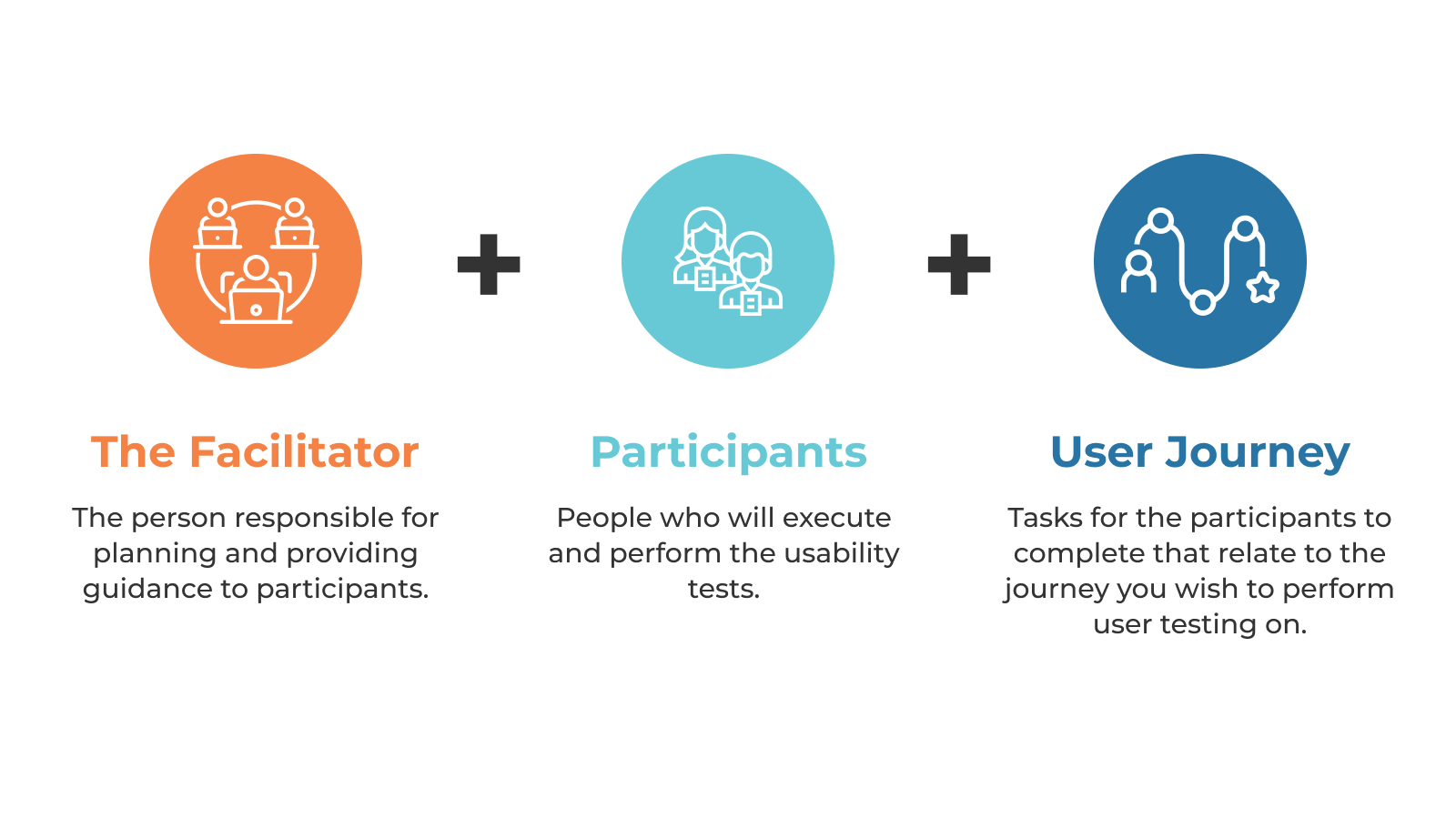
The Facilitator.
The person responsible for planning and providing guidance to participants.
Participants.
People who will execute and perform the usability tests.
User Journey.
Tasks for the participants to complete that relate to the journey you wish to perform user testing on.
The Facilitator gives Participants instructions and guidance to go through a user journey to perform specific tasks. The Facilitator also observes and notes the behaviour and feedback of the Participants.
Now that we’ve established the What, Why, and Who of usability testing, let’s get into the good stuff of How to do it on a budget.
The “How”
Even though the digital world is getting more complex, it doesn’t necessarily mean that our approach has to follow. If you are looking to do usability testing on a budget, the simpler your approach, the better.
Step 1: Planning
- Identify the User: To simulate the most users, I’d suggest using the following groups to keep costs low. Don’t be afraid to ask for help from 5-6 people you know and compensate them for spending 1-2 hours with you. You could also try Cloudsourcing, a technique where participants can be hired for usability testing from similar market regions to offset cost.
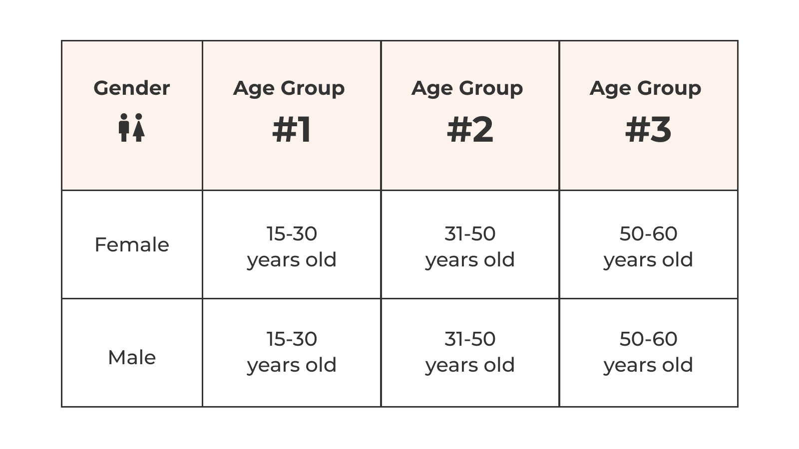
A table showing three age groups and segments of users. Age group 1. 15 to 30 years old. Age group 2. 31 to 50 years old. Age group 3. 50 to 60 years old.
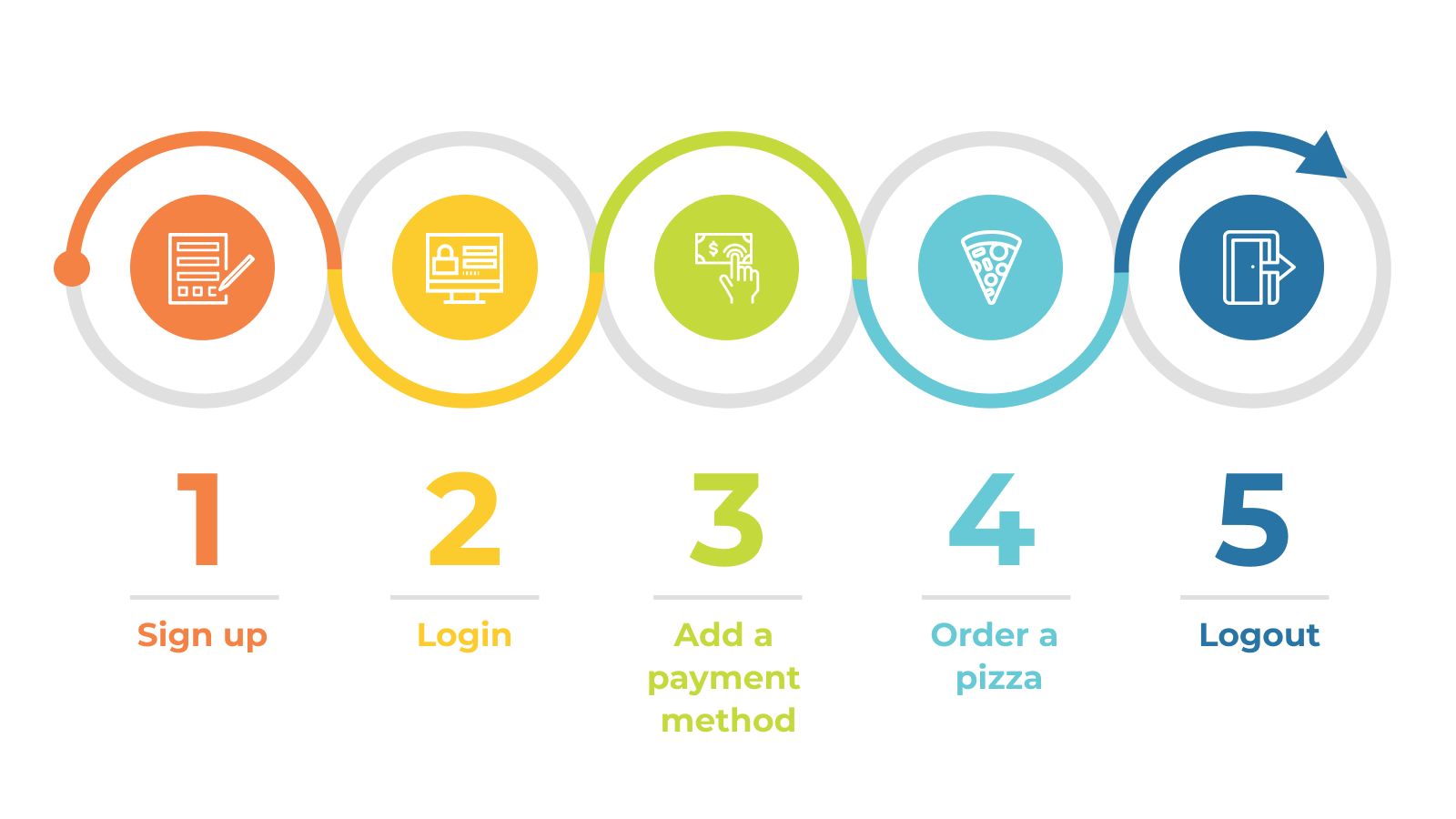
- Identifying the journey: Selecting the right journey is key to success. They must be real user scenarios on an actual production-like application; otherwise, the results won’t mean much. Let’s take a look at a mobile application for food ordering as an example. The following diagram represents a typical journey. The users are expected to go through this journey and provide their assessment on the applications’ behaviour and their preferences.
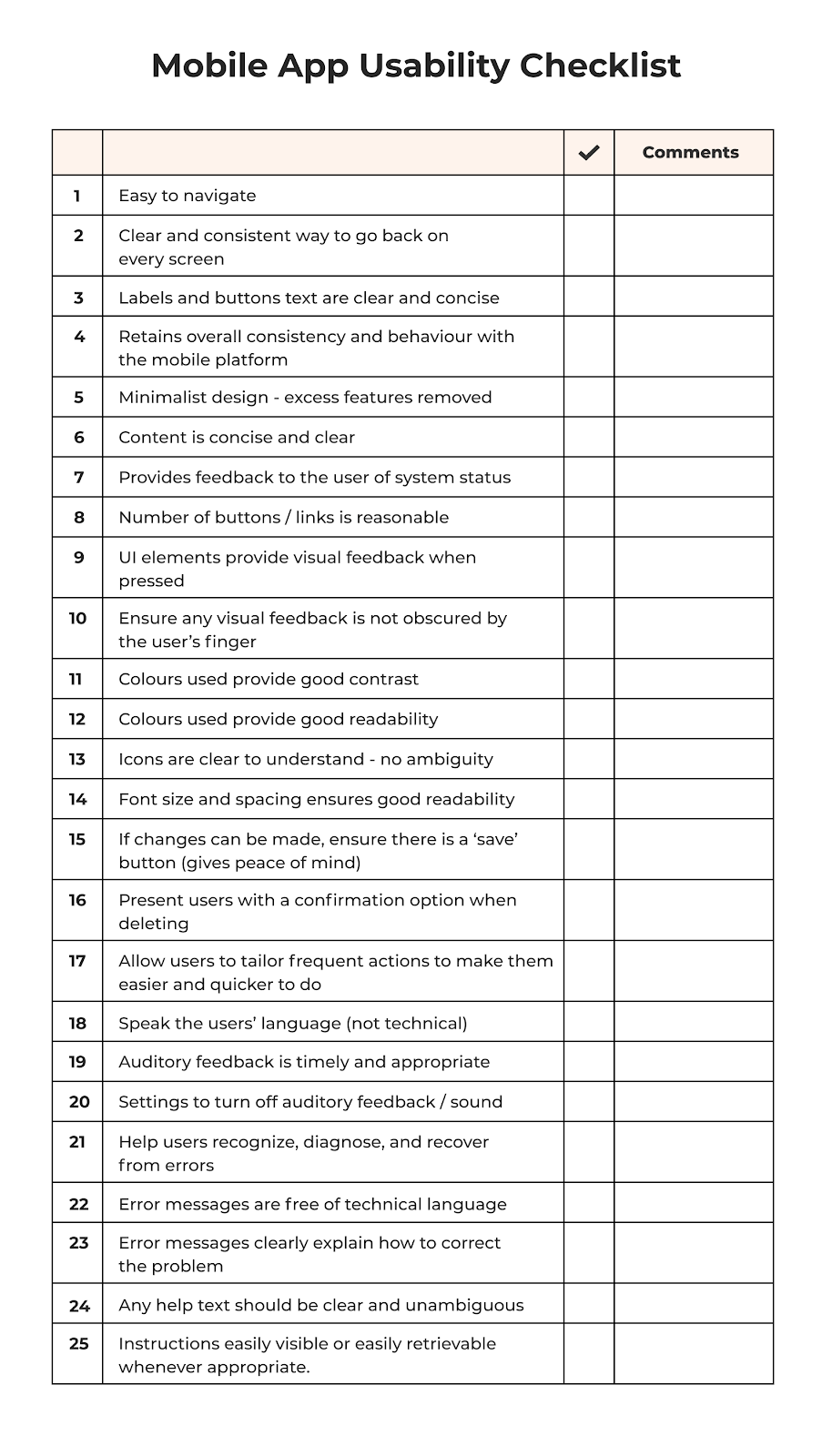
- Set guidelines: Since usability testing is subjective by nature, here is a checklist that you can use to evaluate the user experience when going through the journey.
Step 2: Execution
When it comes time to execute, users go through the determined journey or perform specific tasks on devices provided by the facilitator. Is it essential users all have the same devices, including model and operating system. As they go through the journey of ordering food, ask for feedback on their experience, considering the evaluation guidelines. Participants will then rate their experience on a scale of 1-10 and provide comments.
- Benchmarking with competitors: Another way to gauge the design of your application is through competitive benchmarking. This helps you determine how the thing you are testing stacks up against other similar products. Participants should go through the same journey on competitor applications and rate their experience on a 1-10 scale. The scores of yours and the competitor’s applications should be compared.
Step 3: Analyze
Throughout testing, the facilitator is to observe and collect feedback from the participants and pass it to design for review. The design team then takes that information to learn more about its users and refine the design accordingly.

Take away
It wasn’t fancy. It wasn’t particularly hi-tech. But one thing you can’t argue with is that this approach gets the job done – more importantly, on a budget.
I feel many people overcomplicate what is required in usability testing. All you need is a few people and appreciation as a way of compensation. And while it may not seem like much, this small effort will significantly impact your digital products and the experience they create for their users. Because while we may think all the complexity and complication is impressive, the user only cares about the experience. Now, hopefully, you can help make sure it’s a good one without breaking the bank.
