Part 1: The Challenge and Our North Star
The Challenge
Every now and then, we see designers wasting their time creating UI flow diagrams inside slide decks and whiteboard tools to show UX/UI design to executives or senior management. Designers are also at times found giving walkthroughs of their design files to every member on their team, then to all product managers, then to all developers, then to all the people who missed those calls, and it goes on and on until the end of time. When we have designers working repeatedly on these things, it impacts not just the designers but the whole organization. We want the designers to work on more important things: solving user and product problems. When this starts to happen, the designer’s valuable time and energy are reduced to doing these repetitive tasks.
Design Ops to the Rescue
One of the key areas of Design Ops is to alleviate problems exactly like this.
Our North Star here is to completely eliminate the handover
process of design with stakeholders.
In an effort to achieve this, we need to bring everyone to the same table and have the same language that everyone speaks and understands, which is what Design Ops achieves. This will have two immediate benefits:
- Eliminate (reduce) time wasted by designers doing side tasks.
- Build confidence with stakeholders. Stakeholders feel more comfortable trusting their designers when they can understand their work and process as well. The design department will no longer be seen as a black magic box that no one really knows how it operates.
The shared language will help the stakeholders understand how design files are organized and documented, so they can go and find anything whenever they need it without bugging designers. The documentation on design decisions in best cases eliminates the requirement for tedious walkthroughs, one of the biggest benefits of DesignOps.
Laying the Foundations
As a first step, we set up two keys or legends to identify the state of the design and document the design files.
State of Design Ops
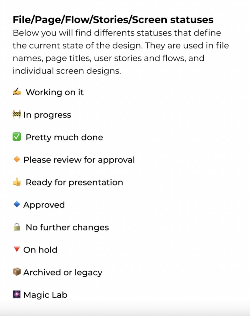
Very similar to project management statuses, we introduce the states of UX/UI design. The key allows anyone coming into the design file to understand their status. This can be used not only to identify design files as a whole but also the pages, user flows, and individual screens. Our first set of statuses look like this (these can be modified and adapted to any team’s needs, but we have found this to be most productive in our case):

✍️ Working on it
Anything that designers are currently working on can be denoted by this status.
🚧 In-progress
Things that are not yet finished but also not being actively worked on can be denoted by in-progress status.
✅ Pretty much done
This status is important to indicate your progress on work. Statuses like these will build confidence with your stakeholders.
🔸 Please review for approval
With this time you are inviting the product manager or other stakeholders to review your UX/UI designs and decisions.
👍 Ready for presentation
UX Designs that have been approved by product managers and the internal team will be ready for executive presentation.
🔹 Approved
Designs approved by all the stakeholders can be marked with this status.
🔒 No further changes
Use this state when a design has been officially locked and you want to hand it off to developers. This will mean that no more changes will be catered to on the design and it is locked until delivery of the project.
🔻 On hold
Designs that get deprioritized due to any reason can be marked as on hold.
📦 Archived or legacy
Any old or deprecated design can go under the archived or legacy label.
🎆 Magic Lab
All the amazing ideas and designs can find their place in the magic lab. These are proposed pieces of design that designers want to showcase or show off but are not part of the main user flow.
Documenting Design
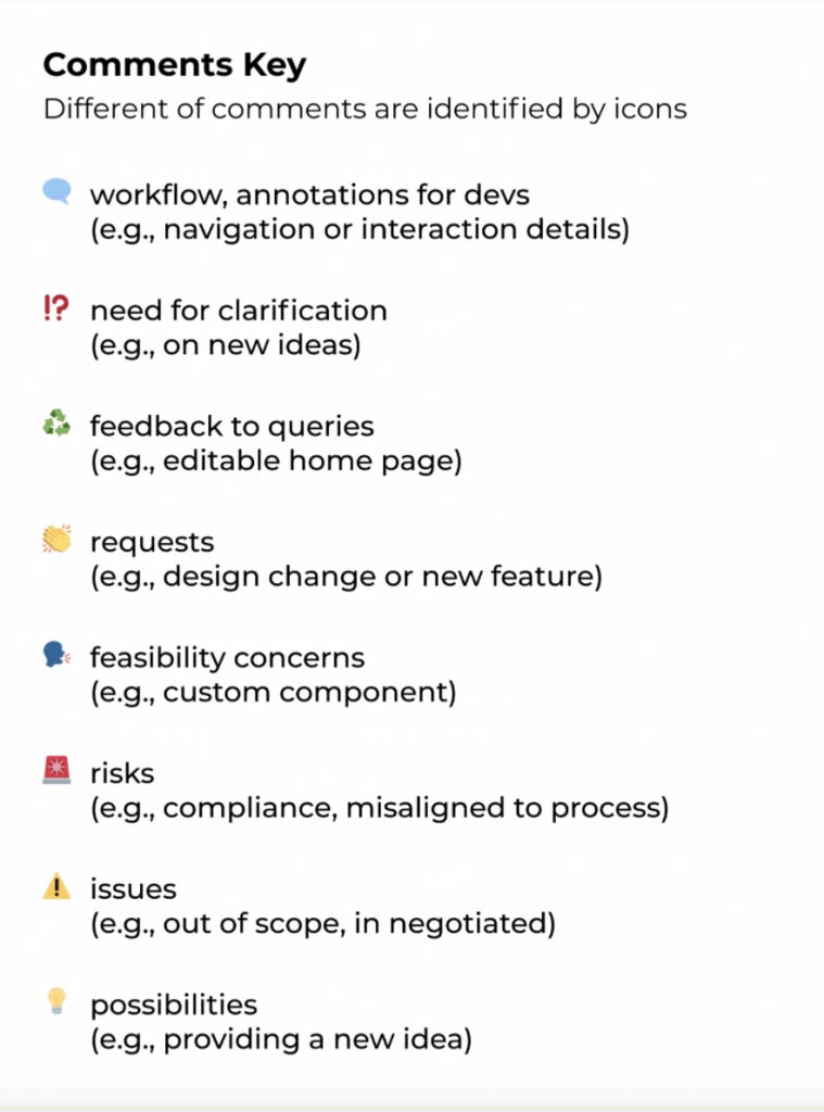
Taking this a step further, we also set up comment keys. These can be used to document design decisions, clarifications, ideas, concerns, and more as raised by designers and stakeholders during the design process. The comment key we generally suggest to use looks something like this:

The status and comment key is part of the Figma File System, a subset of the Figma Design System by mobileLIVE. This can be downloaded free from the Figma community. This is available as ready-to-use components that you can plug in any of your design files and start using them.


