
Data visualization was always an important, albeit niche subject that only the most diligent number and statistically driven businesses and technology practitioners cared about. And then suddenly, the tragic and globe-spanning events of 2020 have made data visualization a mainstream staple. Across the world, eyes are glued to screens, watching bar graphs, line charts, and geographic maps with close intent. Now more than ever, it’s essential to skillfully understand data visualization from the perspectives of both a reader and creator and to be able to understand the various narratives that visualizations can convey.
What is Data Visualization?
Data visualization is defined as the graphical display of data and information, primarily for the purposes of data exploration, communication, or sense-making. This critical distinction separates data visualization from just being graphic design and aesthetics. That’s because it’s also about constructing the right relationship, context, and indicators to communicate to your audience effectively. Data visualization is just as much about usability as it is about being visually appealing. While a typical audience might be more familiar with charts, graphs, and maps, data visualization also includes infographics, gauges, and other forms of visual expression such as iconography and illustration.
Why Visualization? It Makes Biological Sense
Organizations that can gather and act quickly on their data will have a competitive edge in the marketplace due to the speed at which they can make informed decisions. Typically, when encountering data, people use the slow and inefficient cerebral cortex in the front of the brain, responsible for logical thinking and cognition. Choosing to visualize the data shifts the balance towards the fast, automatic, and unconscious processing performed by the visual cortex. With increased efficiency and speed comes increased knowledge, as it becomes easier to isolate new and emerging trends, find patterns, or identify outliers in a data set.
Why Today?
Today, we have more data circulating than ever before, with publications referring to the modern era as the age of ‘Big Data.’ Forbes estimates that we create 2.5 quintillion bytes of data every day, which is only increasing. There is an ever-growing amount of business, technological, and user data captured every day, and it presents compelling opportunities for organizations to interpret and make practical use of it through visualization.
Data visualization’s biggest strength, the ability to create a coherent and human narrative out of hard numbers, is increasingly evident in the age of the 2020 global pandemic. Epidemiologists are encouraging everyone to ‘flatten the curve,’ turning a simple line chart into an artifact that embodies our hopes, fears, predictions, and the responses of the entire world: not bad for a few lines and dots! Understanding data visualization during this unique time will provide you with exciting use-cases and examples to study from, as organizations across the world are utilizing various visualizations to convey different narratives.
How to Start Visualizing
1. Understand Your Audience: The first step in visualizing your data is to determine and define the audience that will be consuming your visualization. Whether your audience understands the subject at hand will determine the granularity of visuals and the specificity of labels.

It can help you think about what decisions you’d like to drive in your audience through your data visualization. Is it an infrequent and significant decision, like purchasing a house, where detailed comparisons are necessary? Or is it more tactical, like a weekly sales performance review that only requires a few metrics? Determining this will inform the visualization elements, such as thresholds for target metrics, or colours, to indicate urgency.
2. Choose the Right Visual: There are an incredible amount of visualizations, variations, and types to choose from: bar graphs, line graphs, pie charts, are just the tip of the iceberg. To determine the correct type, consider the relationship between the items in the original data-set.

A temporal visualization like a line or area chart may be the best fit if it’s data captured over a period of time. A geospatial visualization such as a heatmap or tree graph will communicate more effectively if it relates to a location. Periscope features a handy flow-chart that can help you get started in selecting the right visualization for your needs.
3. Provide Context: Visualizations without context can be challenging to interpret, so titles, labels, and text can help provide your audience with a functional understanding of the visualization.

Ensure that labels have the proper weighting, that the title should be the most prominent, that the axis labels should be legible and balanced, and that bolding should be used sparingly for emphasis.In addition, a legend or annotation can go a long way in improving the usability of your data visualization.
4. Ensure Accessibility: Ensure accessibility with your visualization so that it’s usable and understandable by everyone in your audience. Don’t use colour as the only visual cue; instead, combine both text, colour, and patterns with helping communication.
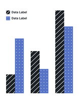
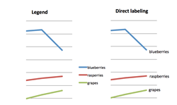
Play around with shapes and sizes that don’t directly represent what’s being conveyed, such as different line styles and text sizes. In addition, always label the data directly, as adding data explanations in labels makes it harder to see, and adds cognitive load to the reader.
Visualization Best Practices
Clarity and Data Accuracy: Data visualization appeals to our unconscious and intuitive visual perception. However, the data represented should still hold up under critical scrutiny. Points of data should retain their original values: it can be far too easy to manipulate data with a visualization that skews itself towards a particular narrative or exaggerates a comparison. Since visualization is meant to be a resource for analysis and sense-making, this should be avoided, and the integrity of the data should always be preserved.
Visual Encoding: Part of the visualization process involves encoding the data points into a visual form through the use of shape, colour, angle, size, and various other visual attributes. By modifying these, you can make distinctions in the data and present it in a more complex format. For example, colour can be utilized to indicate focus, quantity, categories, or even add additional layers of meaning to your visualization, such as red for a negative value. The best data visualizations make creative use of visual attributes to add further context for understanding and analysis.
Labels and Axis: The above principles also apply to the labelling and text that accompany a visualization. For clarity and accuracy, any axis in a bar graph should start at a baseline of 0 to keep the integrity of the data presented. Labels should not be rotated as to ensure their legibility and clarity.
Data Visualization Future Trends: An emerging trend in data visualization, powered by digital technology, is user interaction and control. A few examples are outlined in Google’s ‘Material Design,’ such as progressive disclosure: the ability of the user to reveal pieces of information that they select or interact with. In addition to this, direct manipulation of a visualization through panning, zooming, and scrolling is also finding frequent use today. These controls are often accompanied by filters or toggles that manipulate the data visualization for analysis purposes. Implementing these controls can be an incredibly effective way of allowing your audience to interpret further and make sense of your visualization.
An exciting take on this involves turning visualization interaction into a curated experience or interactive game. The New York Times featured an interactive visualization that allows the user to guess the trends in causes of death and match their results to the real data. The Washington Post features a simulation and modelling of various virus outbreak scenarios, where the users can even re-run each simulation and compare the resulting curves and graphs accordingly. The interactions here provide an additional layer of understanding by letting the user examine their biases and assumptions and tackle complicated and unwieldy topics by ‘humanizing’ large numbers.
Take Away
Never before has data visualization been so relevant. While it may be more mainstream now, it still follows the same principle that has guided data visualization since its inception: turning hard numbers and vast amounts of data into a narrative that is actionable, comprehensible, and human. As long as organizations follow best practices, understand the data, and preserve its integrity, they’ll be able to leverage visualization far into our data-filled future.


