Jump To Section
When we talk about UX & design and, we often discuss research, research-led design, and usability studies. However, while we often finish these discussions with several exciting learnings, we find all of them battling for our attention.
How do you prioritize your work and understand the value a design change could bring to you?
The simple answer? UX Metrics.
What are UX Metrics?
Metrics help support design changes while also allowing UX teams to choose the most critical problems in their product usability. Usually, this framework is used to measure the enterprise user experience so that we can talk with the users and gather vital information from them.
A metric is a measure that we can track, and in this context, a ‘measure’ is the detection of change. Similar to the multitude of metrics that businesses use, such as sales and retention rates, there are several types of UX metrics.

(Diagram by Mark G Brown)
Types of UX Metrics
Consider UX metrics as your key performance indicators (KPIs). The KPIs for UX/UI design are of different types, each of which focuses on a distinct area:
Usability Metrics
These are descriptive metrics that look at how easily users complete a task or event. Commonly tracked indicators like ease-of-use rating, time on task, task success rate, etc., are used to measure the ease of task completion. Advanced usability metrics may also track interaction patterns.
Engagement Metrics
These measure user perception: how users interact with your software, app, or website. They include page views, scrolls, event streams, the time it takes per interaction and the attitude of the occurred interaction.
Conversion Metrics
These measure the outcome of the experience by focusing on smaller groups of users that you can engage for prolonged and retained use of your product to get insights like conversion rates or Net Promoter Score (NPS).
Three UX Metrics For Usability Testing
You might be familiar with some common usability testing metrics and the frameworks that use them.
However, in this article, we’re only talking about the ones that:
- Are both time and cost-efficient and
- were found to be the most effective at providing accurate results – without needing a large sample size of participants!
These methods listed below were handpicked after we tried them out and used them to conduct our own usability testing on a very complex Enterprise Product that we were working on.
1- Single Ease Question or SEQ (Post Task Questionnaire)
The Single Ease Question (SEQ) is a UX performance metric that uses a seven-point scale to rate how difficult users are finding a task. Here’s an example of what this scale may look like:
Example
Overall, how difficult or easy was it to complete the task? Rate your experience using the seven-point scale below.

During usability testing, users are given a post-task questionnaire with this rating scale right after attempting a task to best capture the user’s impression and experience of the task. Since most usability-study sessions will involve many individual tasks, each task followed by such a questionnaire will allow you to extract and record several subjective answers from each user.
Collecting Responses of SEQ through Google Form
Post-task questionnaires should be short – ideally one to three questions – in order to allow minimum interference with the user flow during a testing session.
The SEQ Google Form Survey looks like this.
Interpreting SEQ Scores
Once user responses are collected, you can track the answers using this UX Metrics Scorecard.
You can then interpret these scores on an SEQ Percentile Rank Scale:

On average, SEQ scores fall between approximately 5.3 and 5.6, which is above the midpoint of 4 on the seven-point scale.
One issue of the SEQ as a diagnostic tool is that the questionnaire can lead to users finding it hard to recognize and differentiate the complexity of finishing a task from the actual problems experienced while completing it. So, it is recommended to ask a follow-up question: “What is the primary reason for your score?”
Benefits of Using SEQ
The SEQ method is very useful for two reasons:
- Since it is conducted right after task completion, the SEQ method gathers users’ immediate thoughts and impressions, as the experience is still fresh in their minds. Hence, the participants can clearly assess how they felt during the experience without any other tasks or thoughts hindering their memory.
- With the data being collected right after every task, the SEQ method allows easy comparison of the most problematic issues in your workflows for every task.
Post-task questionnaires should be short – ideally not more than 1 to 3 questions – in order to allow minimum interference with the user flow during a testing session.
Note: There are many user testing platforms like User Testing, Usabilla, or Maze that can help you measure task time and success. The UX metrics methods quoted above are what we used for an Enterprise Product.
2- System Usability Scale or SUS (Post Test Questionnaire)
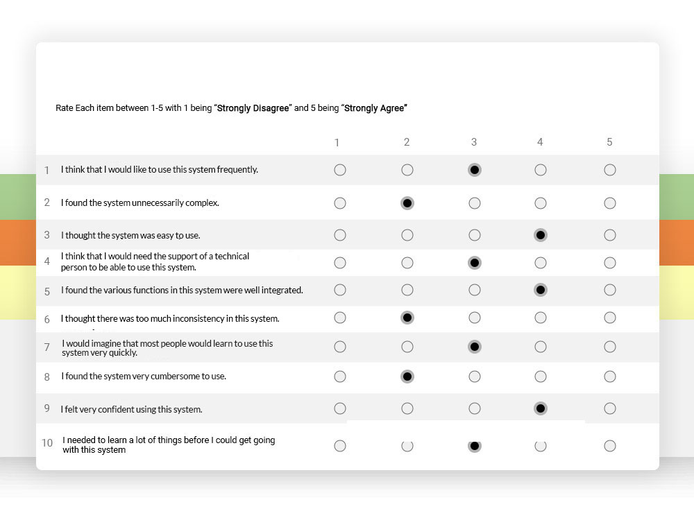
A post-test questionnaire, the System Usability Scale contains ten different questions. Each of these questions has five responses – from strongly agree to strongly disagree – to gauge the usability and learnability of the system.
Example

As the name suggests, this post-test questionnaire is given out at the end of a session after participants have completed all tasks in the usability test.
According to an article on perceived usability published by the Nielsen Norman Group, post-test questionnaires “reflect how your users perceive the usability of your website or app as a whole”. They are meant to capture this assessment from the perspective of the user, including “their lasting overall impressions”. The impressions on your users of the experience as a whole are subject to something known as the peak-end effect, which is that “the most intense and last parts of the experience, either positive or negative, impact the participants’ recollections and evaluations the most”.
Conducting Usability Session by SUS through Google Form
To conduct the usability session by SUS, here’s the Google Form Survey you can use.
The formula used to score SUS is as follows:
- For odd items: subtract 1 from the user response.
- For even items: subtract user responses from 5.
- This will scale all values from 0 to 4 (with 4 indicating the most positive response).
- Add up all of the converted responses from each user and multiply the total by 2.5. This will convert the range of all possible values from 0 to 100 instead of from 0 to 40.
Formula:

Interpreting SUS Scores
Just as we did in SEQ, a UX Metrics Scorecard is used here as well, which looks like this.
Based on research, a SUS score above 68 would be considered above average, and anything below 68 is below average.
In order to have the usability of your site be in the top 10% of all sites, you’d require a score of 80 or higher, while a score of 73 would put you only in the top 30%.
The best method of interpreting your score is through the process of normalization, in which the scores are converted to a percentile rank. The grading scale below shows how the percentile ranks can be associated with SUS scores and letter grades to interpret the results.

Benefits of Using SUS
With references in more than 1300 publications and articles, the SUS method has made its mark as an industry standard.
Some of the noted benefits of using SUS, according to usability.gov, are:
- It is relatively a very easy scale to apply to participants
- It provides reliable results even when administered on small sample sizes
- It is very valid in that it effectively differentiates between usable and unusable systems.
3- Usability Metric for User Experience (UMUX)
A result of research at the Intel Corporation in 2010, the UMUX method came about as a replacement for the SUS to create a tool that was not just shorter than the SUS but also conformed to the ISO 9241–11 definition of usability (i.e., effectiveness, efficiency, satisfaction).
The UMUX method is used for testing perceived usability via a four-item questionnaire. Scores are measured on a seven-point option scale, which goes from Strongly Disagree (1) to Strongly Agree (7), and the scores range from 0 to 100.
Interpreting UMUX Scores
The UMUX is best used after a usability test in the following way:
- Determine what method you will use to distribute the questionnaire. A pen and paper will suffice for in-person testing, but you can use an online survey tool for remote testing.
- While scoring UMUX, odd items are scored as [score — 1], while even items as [7 — score]. The scores are summed up, and the total is then divided by 24 and multiplied by 100.
To conduct a usability audit, we always let users know as much as possible about all the scenarios, tasks, participants, and facilitators, as well as provide them with brief information within the given time.
UX Metrics Test Plan Template
Here is a sample usability test plan template to use before conducting Usability Testing.
Takeaway
There are many factors that come into play when deciding what metrics will work best for you; the ones discussed in this article were shortlisted because they were found to be the most time-effective and easily compatible with smaller sample sizes of participants.
As is the case with many other UX researchers and designers, budget-friendliness was also a very important reason we ranked these methods at the top. If cost-efficiency is something you’re concerned with, you’ll appreciate this article about Usability Testing on a Budget.
All in all, UX performance metrics are vital in UX research, particularly as a KPI for UX UI design. But it is also equally important to understand why UX metrics are used and which ones to use at what stage of your usability testing process will ultimately pave the way for you to achieve your main goal: consistently providing an unforgettable user experience.


