Jump To Section
Whenever you’re tasked with a new project, what’s the first thing you do?
Surely, whether you’re a UX designer, a manager, or a stakeholder in the project, your first step would almost always comprise the ideation phase.
But while most companies will follow through with the ideation process, there’s one very important step they’ll often skip – and in my opinion, it’s definitely NOT something to miss out on if you want to get a clear direction for the project right at the beginning.
I’m talking about storyboarding for user experience design, and in this article, you’ll learn exactly what a UX storyboard is, how to build one, and why it is essential to create a logical story that has:
- a strong plot
- a structured narrative
- a focus on the main goal you’re trying to achieve
What is Storyboarding in UX Design?
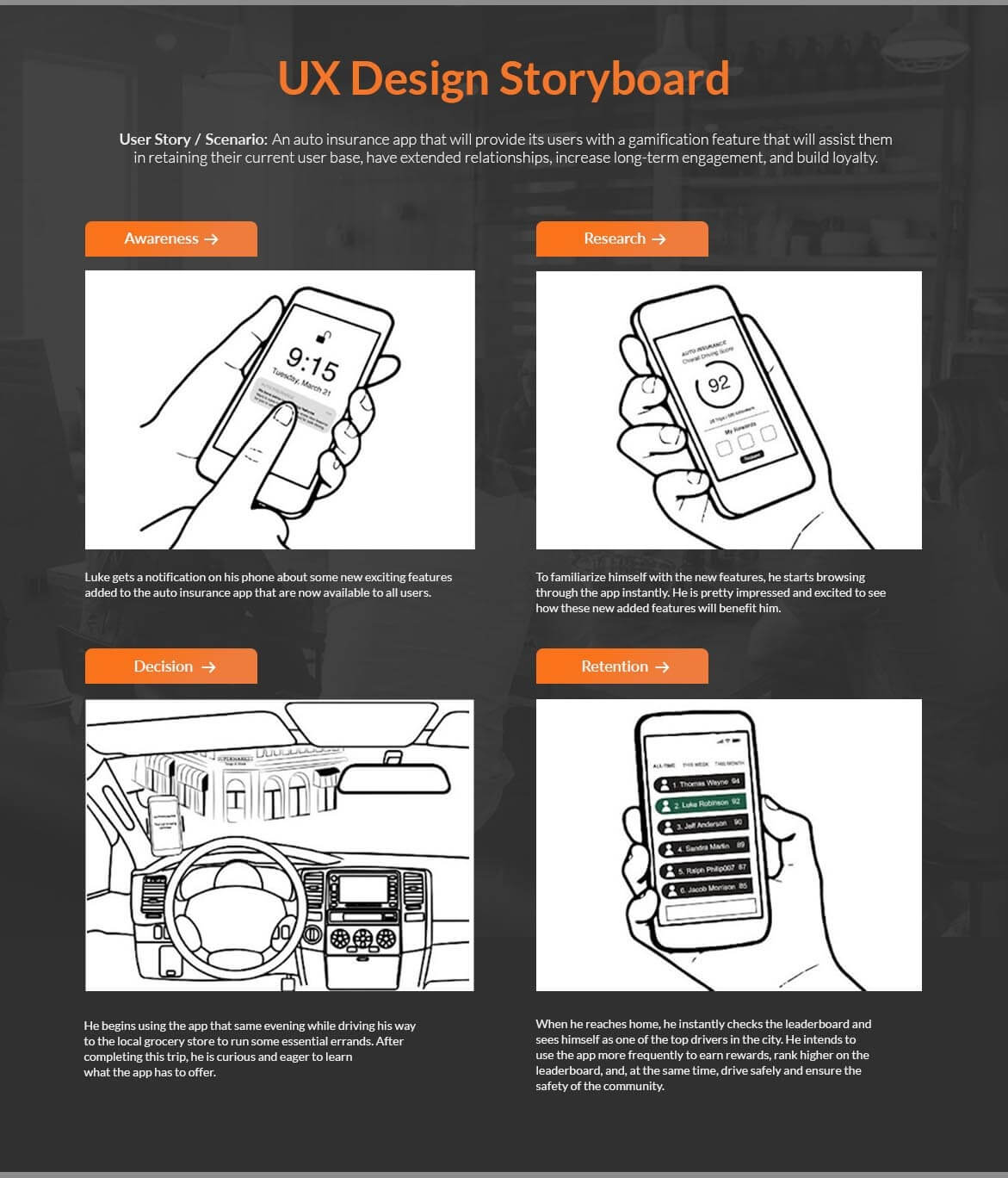
A storyboard is a powerful visual communications tool to improve user stories by making them more authentic, emotional, simple, and clear. The underlying philosophy being that visual representations offer a far easier way to see elements making up the “big picture” storyboard than a text-based document.
First used in the early 1930s by filmmakers and animators at Walt Disney, a visual storyboard served as a means to graphically represent scenarios that contain a sequence of a few events. In UX design, storyboards are therefore a natural fit when it comes to representations of user interfaces, user events, new features, etc.

Source: Disneyparks.disney.go.com
Storytelling and Storyboarding in UX Design
A UX storyboard helps strengthen your research phase by exploring and visually predicting the user experience and interaction with a product over time, giving designers a clear sense of the user’s priorities and goals even before the product or service is launched.
UX storyboarding is a quick way to demonstrate how someone might interact with a future service or product. Through visual storytelling, you can easily set the ground for the whole team to come together and quickly grasp the essential aspects of the project – like the target audience, the occasion, and the goal.
A storyboard starts off with a simple rough sketch and ideally includes not more than four to six scenes to show the story – that’s what makes it so easy to work with and what makes it important to carry out right in the early stages of the ideation phase so that the entire team can get a direction for the project from the very beginning.
Besides having a strong visual presence that boosts engagement within the team and helps store information in the brain long term through visual elements, storyboarding in UX design also breeds an emotional connect and appeal. This equips team members better to put themselves in their target audience’s shoes and visualize the user experience.
It’s important to note here that storytelling and storyboarding in UX design is not the same as mapping out user journeys:
What is the difference between user journey and storyboards?
The most important distinction between a user journey and a UX storyboard lies in their content; while storyboarding in UX design comprises visual representations of the main events of a scenario, user journeys are far more detailed and contain complex, textual information about the process that your customer will be going through in order to achieve a goal.
To understand this distinction more simply, look at a UX storyboard as a tool that captures a fragment of the entire user journey.
A UX storyboard is, most of the time, a rough, informal illustration to set the context of the project by providing a scenario (story) visually so that the whole team can get the right direction of the project from the get-go before getting into action.
A user journey, on the other hand, doesn’t just draw on high-level emotions or ideas of one particular situation but, in fact, extensively details the insights from various stages of the user’s journey of experiencing the product/ service till the time they achieve their goal with it.
When and Why You Would Need To Use Storyboarding in UX Design
Storyboarding in design thinking is done early in the design process, typically during the ideation or discovery phase. The main reason for early storyboarding is to gather insights from the team and see if everyone is striving towards the same goal while ensuring that the user needs are being considered explicitly. Storyboarding in UX design, in turn, creates a way for teams to collaborate and find new solutions for users by staying aligned on a shared thinking and vision about the user experience.
That answers WHEN storyboarding should take place, but what about WHY it’s even needed?
Here are some of the biggest reasons why storyboarding in UX design can be the most vital step in your ideation process:
Human-centered Design Approach
While storyboarding in UX design, the people are central to the design process. Stories put a human face to user data, analytics, and research findings.
User Flow
Designers always think about their users and put themselves in their shoes to see how users interact with the product. This approach enables the designers to fully understand any existing interaction scenarios as well as test predictions about potential new ones.
‘Pitch and Critique’ Method
Since storyboarding in UX design is a collaborative effort, it provides everyone a chance to contribute to the activity. This results in a clearer picture of what should be developed and promoted as new design concepts. Each scene of the UX storyboard should be analyzed to allow team players to leave their reviews and create insights.
Iterative Approach
Storyboarding in UX design is heavily reliant on an iterative approach; sketching out a UX storyboard helps designers experiment with a variety of things with very little or no cost at all when it comes to testing multiple design ideas simultaneously. Since these sketches are so quick and rough, nobody gets too attached or connected to the ideas that are generated.
How Do You Create A UX Storyboard?
While it’s mostly an informal activity, you can still structure your storyboard in a way that helps you and your team fully reap its benefits.
Structure of a Storyboard
Before you start directing your storyboard for UX, you will need to ensure that you understand all the basics of the story.
Understanding the story in its entirety and then breaking it up into pieces can help you approach it in the best and most convincing way possible. For a story to be considered well-structured, it should have a comprehensive beginning, middle, and ending, in addition to the main elements that every storyboard must comprise.

Main elements of a UX storyboard
The Character
Your character – or the persona – is the central figure or hero of your story. Everything associated with your persona is very crucial, for example, behavior, feelings, expectations, and decisions made by the focal person. It is also essential to reveal the mindset of your character completely in order to illustrate the situation best. Address questions like:
- What is the problem faced by the main person?
- How is the problem resolved?
- What are the needs/wants of the main character?
- What are the goals/clear outcomes to be achieved from the whole scenario?
The Scene
You will need to have a realistic, recognizable, and relevant environment for your persona to live and thrive in this scenario. The scene is the space that the character finds himself or herself in.
The Plot and Narrative
The plot needs to be highly convincing, simplistic, and realistic in nature. The narration of the story must be focused on the goal of the character in the plot.
Your plot should start with an event and end with a benefit or a solution to the problem that the persona will be facing in the scenario There must be a clear conclusion to the persona’s journey so that lessons are learned and assimilated by the project team.
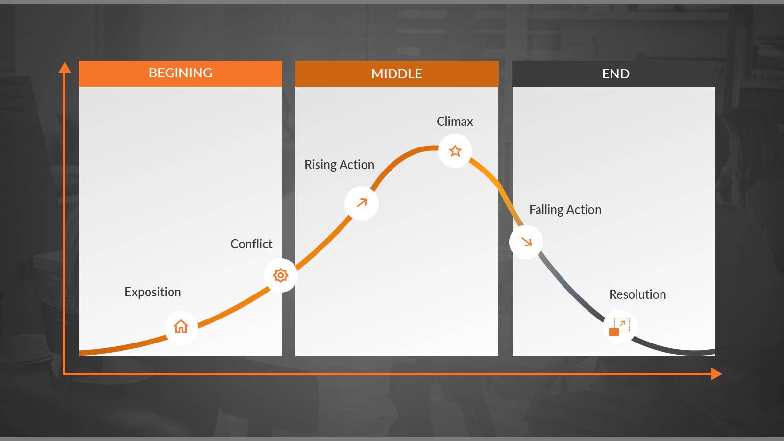
To structure your plot better, you can use Freytag’s Pyramid, which shows the following five acts:
- Exposition
- Rising Action
- Climax
- Falling Action (or final suspense and resolution) and
- Denouement (Conclusion)
Freytag’s Pyramid Template

Takeaway
In this entire article, we discussed what a UX storyboard is, when you would need a visual storyboard, how storytelling and storyboarding in UX design are carried out, and why storyboarding is needed.
To sum up this entire lesson on storyboarding in UX design, here are some key takeaways to keep in mind before you get into your next project:
- A UX storyboard assists in getting a good understanding of the people you’re designing for. One cannot understand good design if they do not understand people.
- Storyboarding in UX design is an outstanding visual tool for designers to bring conceptual ideas to life before they start ideating with their team.
- Designers put themselves in the user’s shoes, visualize their product journey, and address the pain points through visual communications tools like UX storyboard tools.


